Wednesday, 10 January 2018

experiments with album and advert


For the advert I experimented by creating 2 different types of posters one was inspired by one of the case studies I did by Jay Park. This is the first experiment where I printed a black background and the photo I was using and taped them together using masking tape. I then scanned the image in and replaced the scanned photo with a digital one as the quality of the image was quite grainy. For my second experiment I layered the image on top of one another and used colour dodge on one layer to make the image darker and to create more shadows. I them add the text and added a drop shadow to the text to make it stand out more.  


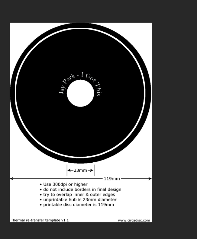
For the actual CD I added an image of the city at first and created white outlines for the CD. I then created the text in Adobe Illustrator to wrap around the circle by creating a circle in illustrator and typing on the path of the circle. I exported this to photoshop and resized it where I place it around the inner circle of the CD. When I added the CD with the image of the city to my inside inserts I felt like I had used too much imagery. Therefore, I created the second CD experiment, where I used a faint dark grey gradient to fit my colour scheme. I kept the white lines and the text where they were, but this was better as it did not over complicate the look of my inside inserts. 

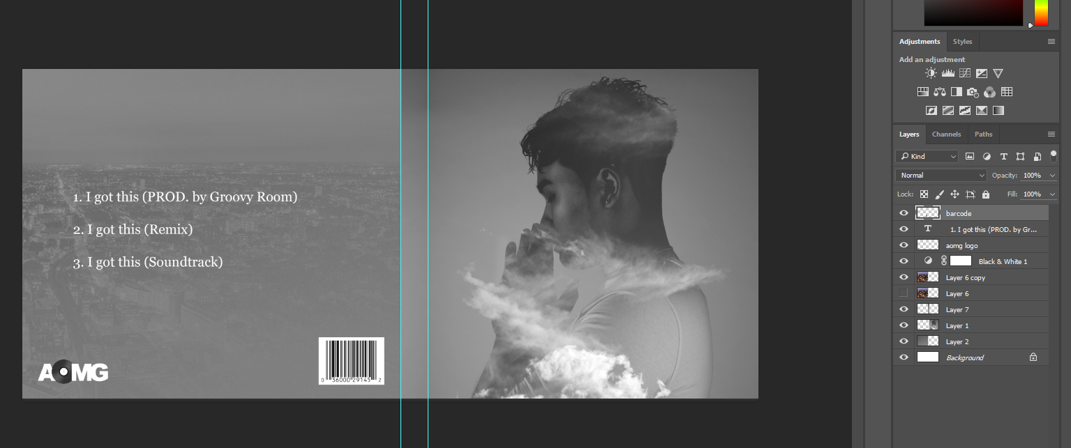
Here I used the photo I had edited for the inside insert. At first, I had left the right side a plain grey gradient, however it looked odd next to the left side insert. So I decided to make it consistent by adding clouds to the left side panel. I lightened the images as it was quite dark at first and there were too many shadows, which did not match the outer cover of the album I had designed. 


For the front cover I used the image I had edited with the clouds. I covered part of his face to make a mood like he does not care like Jay Park. For the spine I added the company logo and a CD production number and the artist’s name and title of the album. I added the track list at the back. I had the back plain at first but thought it was too plain, so I added a picture of the city without a lowered opacity at softer light. I added the barcode and the company logo here too. 

Tuesday, 9 January 2018

Research and Planning draft


I worked on the write up about my research and planning 


design progress


I started deisgned the back of the CD cover with the track list and I added features like the barcode and company logo. I didn't want to add another picture of the artist at the back so I decided to add a picture of the city to link it with the music video.

Monday, 8 January 2018

beginning designs


I started designed my CD cover and the inside of the CD and how I wanted it to look. I created the name and title for the inside of the CD in illustrator so that I could get it to curve around the centre of the CD without becoming distorted in photoshop. I then added my edited photo to the front cover of my album and added the name of the artist and the album. 

Thursday, 4 January 2018

edited photos for album


On Photoshop I edited the picture I took in the photography studio to use for my album and advert. I added images on top of the photos and pasted into the model's silhouette. I added clouds and buildings to depict London and the cloudy weather of London to link the album with the music video. I changed the contrast and brightness of the photos and added highlights and shadows to certain points in the picture I felt needed to be exaggerated, for example the highlight on the cheek. I added experimented with some of the effects for the photos and tried to add some colour to change it up a bit, as I felt that having it all in black and white made the images too flat not stand out.

photoshop photography pics


On Photoshop I edited the pictures I took at the photography studio. I added more shadows to the image and changed the contrast and saturation. Furthermore I added highlights to certain areas where I wanted to exaggerate the light, like the cheek and the front of the hands.I thought the photo by itself looked quite plain so I added a cloud image on top of the photo. I changed the layer type to lighten and changed the opacity to make it more opaque, so you could still see the model in the picture. I tried the image with the coloured image of the sky and this gave it a bluish hue. I then tried it with just black and white clouds and after I combined them both together.

Tuesday, 5 December 2017

response to CD feedback

From the feedback I got from my mock up designs of my album. It seems that the black and white colour scheme was ok with some people, however it also felt odd as we did not include black and white scenes in our music video and the album was black and white. So I have thought about adding some colour to my album instead of doing it all in black and white. Also some of the font placement seemed odd because it would overlap the artists in an odd way and a different font would have been better to use for the CD cover. Also the company logo was included in the front and could have been removed and put on the back of the album instead. 

From the feedback I got from my pitch I have decided to add a bit more colour to my album as the black and white colour scheme did not seem to work well with my mock up design.

Props won’t be used in the photoshoot or the album cover. For many Jay Park albums the picture of him on the album is usually him looking away. Therefore the poses the model will make will be of him looking away and looking like he does not care. A close up will be used on the album cover to see the model’s face clearer and to show that this is their album.

For the font I have decided to use a serif font as I think it will work well with the genre of the album, which is hip hop.

For the back of the album I will use a block colour for the background with the track list, as this is how it was done from the case studies I looked at.

For my advert I will use the same colour scheme as my album cover and I will include a mid-shot of the artist. I will use a studio shot to keep it consistent with the album. The album name and date will be added at the bottom of the advert so as not to cover the picture of the artist. The artist will pose in a way as if he doesn’t care and not face or look directly into the camera.