
Friday, 15 December 2017
Thursday, 7 December 2017
Tuesday, 5 December 2017
response to CD feedback
From the feedback I got from my mock up designs of my album.
It seems that the black and white colour scheme was ok with some people,
however it also felt odd as we did not include black and white scenes in our
music video and the album was black and white. So I have thought about adding
some colour to my album instead of doing it all in black and white. Also some
of the font placement seemed odd because it would overlap the artists in an odd
way and a different font would have been better to use for the CD cover. Also
the company logo was included in the front and could have been removed and put
on the back of the album instead.
From the feedback I got from my pitch I have decided to add
a bit more colour to my album as the black and white colour scheme did not seem
to work well with my mock up design.
Props won’t be used in the photoshoot or the album cover.
For many Jay Park albums the picture of him on the album is usually him looking
away. Therefore the poses the model will make will be of him looking away and
looking like he does not care. A close up will be used on the album cover to
see the model’s face clearer and to show that this is their album.
For the font I have decided to use a serif font as I think
it will work well with the genre of the album, which is hip hop.
For the back of the album I will use a block colour for the
background with the track list, as this is how it was done from the case
studies I looked at.
For my advert I will use the same colour scheme as my album
cover and I will include a mid-shot of the artist. I will use a studio shot to
keep it consistent with the album. The album name and date will be added at the
bottom of the advert so as not to cover the picture of the artist. The artist will
pose in a way as if he doesn’t care and not face or look directly into the
camera.
Monday, 4 December 2017
Friday, 1 December 2017
Creating mock up design
I started making a mock up of how I want my album to look like on photoshop. I have used a black and white theme on this album cover.

Album cover case studies task
We were introduced to our new task which is to do a case study on album covers and album adverts which we can use to help us with our album designs.
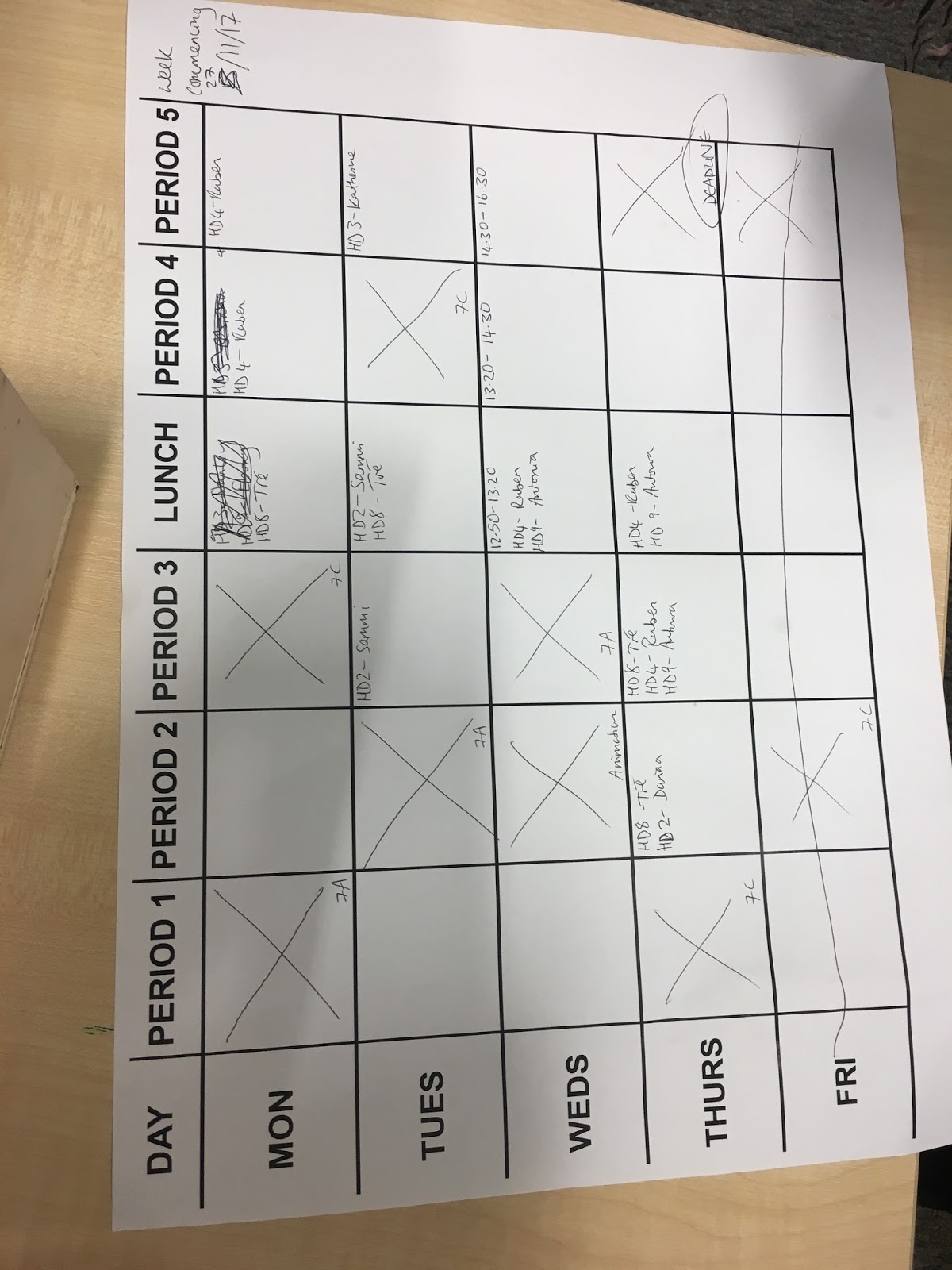
Monday, 27 November 2017
Friday, 24 November 2017
editing
We used the editing software Premier Pro to edit our music
video. We stored the files on a hard drive which we had to book to use whenever
we wanted to do some editing in our own time. We placed our footage over the
audio of the song we had in the timeline and would cut the footage to match the
lip sync and to make it look smoother when transitioning to another shot. Some
of the footage we had was a bit shaky, so we used an effect in premier Pro
called Warp Stabiliser which made the shakiness of the footage smoother. So, of
the footage’s lighting was also over exposed or too dark so we used a three-way
colour corrector on the program to change the lighting and brightness of the
footage.


Thursday, 23 November 2017

Tuesday, 21 November 2017
Re-shooting Footage
From the feedback we got we realised that the footage we had was not good enough to finish the whole music video with, therefore we decided that we needed to re-shoot some location footage. Luckily for us the actor was free before the filming deadline so we were able to re-film footage for our music video and produce better quality footage.
Subscribe to:
Comments (Atom)
-
 Front, Spine and Back Cover Inside Panels without CD insert Inside Panels with CD insert CD Insert Advert ...
